Card
Cards can be used for headers and footers, a wide variety of content, contain contextual background colors and images.
Example
Base card
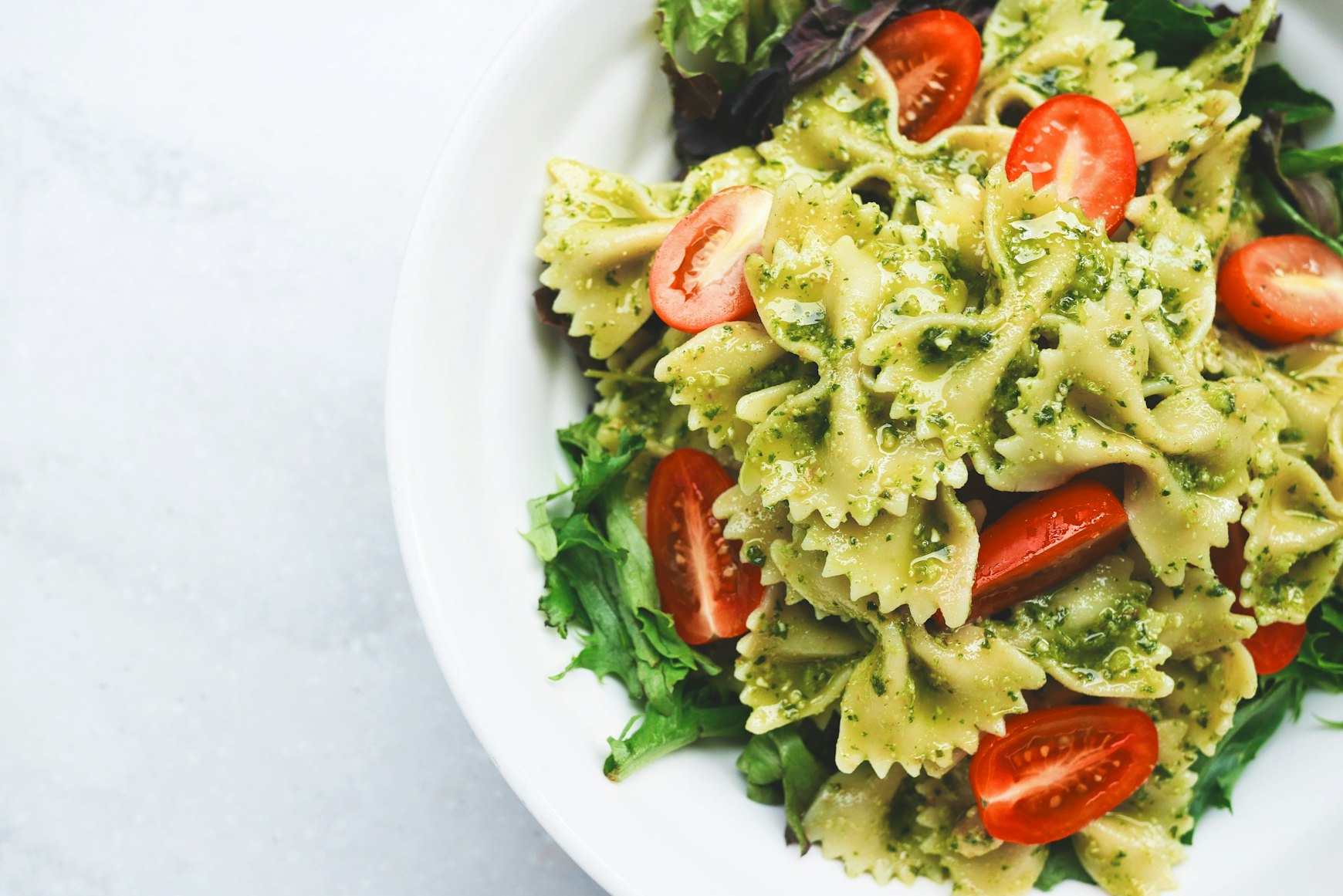
Card Title
Some quick example text to build on the card title and make up the bulk of the card's content.
Go somewhere<div class="card sgds">
<img class="card-img-top" alt="img alternate text goes here"
src="https://images.unsplash.com/photo-1473093295043-cdd812d0e601?ixlib=rb-1.2.1&ixid=MnwxMjA3fDB8MHxwaG90by1wYWdlfHx8fGVufDB8fHx8&auto=format&fit=crop&w=1740&q=80">
<div class="card-body">
<h3 class="card-title">Card Title</h3>
<p class="card-text">Some quick example text to build on the card title and make up the bulk of the card's
content.
</p>
<a class="card-link" href="#">Go somewhere</a>
</div>
</div>Card with Call To Action (CTA)

Card Title
Some quick example text to build on the card title and make up the bulk of the card's content.
Go somewhere
Card Title
Some quick example text to build on the card title and make up the bulk of the card's content.
<div class="sgds-example-card-grid">
<div class="card sgds"><img class="card-img-top" alt="img alternate text goes here"
src="https://images.unsplash.com/photo-1473093295043-cdd812d0e601?ixlib=rb-1.2.1&ixid=MnwxMjA3fDB8MHxwaG90by1wYWdlfHx8fGVufDB8fHx8&auto=format&fit=crop&w=1740&q=80">
<div class="card-body">
<h3 class="card-title" href="#">Card Title</h3>
<p class="card-text">Some quick example text to build on the card title and make up the bulk of the
card's content.</p>
<a class="card-link" href="#">Go somewhere</a>
</div>
</div>
<div class="card sgds">
<img class="card-img-top" alt="img alternate text goes here"
src="https://images.unsplash.com/photo-1473093295043-cdd812d0e601?ixlib=rb-1.2.1&ixid=MnwxMjA3fDB8MHxwaG90by1wYWdlfHx8fGVufDB8fHx8&auto=format&fit=crop&w=1740&q=80">
<div class="card-body"><a class="card-link" href="#">
<h3 class="card-title">Card Title</h3>
</a>
<p class="card-text">Some quick example text to build on the card title and make up the bulk of the
card's content.</p>
</div>
</div>
</div>Informational card

Card Title
Some quick example text to build on the card title and make up the bulk of the card's content.
<div class="card sgds">
<img class="card-img-top" alt="img alternate text goes here"
src="https://images.unsplash.com/photo-1473093295043-cdd812d0e601?ixlib=rb-1.2.1&ixid=MnwxMjA3fDB8MHxwaG90by1wYWdlfHx8fGVufDB8fHx8&auto=format&fit=crop&w=1740&q=80">
<div class="card-body">
<h3 class="card-title">Card Title</h3>
<p class="card-text">Some quick example text to build on the card title and make up the bulk of the card's
content.
</p>
</div>
</div>Customise card sub-components' HTML Elements
Card Title
Some quick example text to build on the card title and make up the bulk of the card's content.<div class="sgds-example-card-grid">
<div class="card sgds">
<div class="card-body">
<h5 class="card-title">Card Title</h5><a class="card-text">Some quick example text to build on the card title
and make up the bulk of the card's content.</a>
</div>
</div>
<div class="card sgds">
<div class="card-body">
<h1 class="card-title">Card Title</h1><strong class="card-text">Some quick example text to build on the card
title and make up the bulk of the card's content.</strong>
</div>
</div>
</div>Stretched link

Card Title
Some quick example text to build on the card title and make up the bulk of the card's content.
<div class="card sgds"><img class="card-img-top" alt="img alternate text goes here"
src="https://images.unsplash.com/photo-1473093295043-cdd812d0e601?ixlib=rb-1.2.1&ixid=MnwxMjA3fDB8MHxwaG90by1wYWdlfHx8fGVufDB8fHx8&auto=format&fit=crop&w=1740&q=80">
<div class="card-body"><a class="card-link stretched-link" href="#">
<h3 class="card-title">Card Title</h3>
</a>
<p class="card-text">Some quick example text to build on the card title and make up the bulk of the card's
content.</p>
</div>
</div>Card group

Card Title
Some quick example text to build on the card title and make up the bulk of the card's content.
Go somewhere
Card Title
Some quick example text to build on the card title and make up the bulk of the card's content.
Go somewhere<div class="sgds-example-card-grid">
<div class="card-group">
<div class="card sgds">
<img class="card-img-top" alt="img alternate text goes here"
src="https://images.unsplash.com/photo-1473093295043-cdd812d0e601?ixlib=rb-1.2.1&ixid=MnwxMjA3fDB8MHxwaG90by1wYWdlfHx8fGVufDB8fHx8&auto=format&fit=crop&w=1740&q=80">
<div class="card-body">
<h3 class="card-title">Card Title</h3>
<p class="card-text">Some quick example text to build on the card title and make up the bulk of the card's
content.
</p>
<a class="card-link" href="#">Go somewhere</a>
</div>
</div>
<div class="card sgds">
<img class="card-img-top" alt="img alternate text goes here"
src="https://images.unsplash.com/photo-1473093295043-cdd812d0e601?ixlib=rb-1.2.1&ixid=MnwxMjA3fDB8MHxwaG90by1wYWdlfHx8fGVufDB8fHx8&auto=format&fit=crop&w=1740&q=80">
<div class="card-body">
<h3 class="card-title">Card Title</h3>
<p class="card-text">Some quick example text to build on the card title and make up the bulk of the card's
content.
</p>
<a class="card-link" href="#">Go somewhere</a>
</div>
</div>
</div>
</div>Action card
Laptop
Apple
Macbook Pro M1
Laptop
Apple
Macbook Pro M1
Laptop
Apple
Macbook Pro M1
<div class="sgds-example-card-grid">
    <div tabindex="0" variant="card-action" class="card sgds">
        <div class="card-body">
        <h6 class="text-muted card-subtitle">
            <div><i class="bi bi-box"></i>Laptop</div>
            <div class="card-input">
                <div class=""><input aria-label="selectablecard" type="checkbox" class="form-check-input"><label title="" class="form-check-label"></label></div>
            </div>
        </h6>
        <h5 class="card-title">Apple <i class="bi bi-apple"></i></h5>
        <p class="card-text">Macbook Pro M1</p>
        </div>
    </div>

    <div tabindex="0" variant="card-action" class="card sgds">
        <div class="card-body">
        <h6 class="text-muted card-subtitle">
            <div><i class="bi bi-box"></i>Laptop</div>
            <div class="card-input">
                <div class=""><input aria-label="selectablecard" type="radio" class="form-check-input"><label title="" class="form-check-label"></label></div>
            </div>
        </h6>
        <h5 class="card-title">Apple <i class="bi bi-apple"></i></h5>
        <p class="card-text">Macbook Pro M1</p>
        </div>
    </div>

    <div tabindex="0" variant="card-action" class="card sgds">
        <div class="card-body">
        <h6 class="text-muted card-subtitle">
            <div><i class="bi bi-box"></i>Laptop</div>
            <div class="card-input">
                <div class="form-switch"><input aria-label="selectablecard" type="checkbox" class="form-check-input"><label title="" class="form-check-label"></label></div>
            </div>
        </h6>
        <h5 class="card-title">Apple <i class="bi bi-apple"></i></h5>
        <p class="card-text">Macbook Pro M1</p>
        </div>
    </div>
</div>Quantity toggle card
Basket
Item Brand
Apple
<div variant="card-action-quantity-toggle" class="card sgds">
    <div class="card-body">
        <div>
            <h4 class="card-title">Basket <i class="bi bi-cart"></i></h4>
            <button type="button" class="btn-close" aria-label="Close"></button>
        </div>
        <div>
            <div class="card-unit">
            <h5 class="text-muted card-subtitle">Item Brand</h5>
            <h6 class="mt-2 card-subtitle">Apple</h6>
            </div>
            <label class="visually-hidden form-label">quantity-toggle</label>
            <div variant="quantity-toggle" class="input-group input-group-sm sgds">
                <button aria-label="minus-btn" type="button" class="btn btn-primary sgds"><i class="bi bi-dash"></i></button>
                <input aria-label="Quantity" name="quantity" min="0" type="number" class="text-center form-control" value="0">
                <button aria-label="plus-btn" type="button" class="btn btn-primary sgds"><i class="bi bi-plus"></i></button>
            </div>
        </div>
    </div>
</div>Anatomy
Default card

- Image (situational): Gives context to the user as to what the card is about.
- Title: Serves to let the user know exactly what the card is about, ideal to keep this short and to the point.
- Description: Serves to give users information on the card.
- CTA (situational): When you need users to take a action, this can be omitted if the card is meant to display only information. Text link can be replaced by a button if needed if the situation calls for it.
Action card

- Icon: Gives more context to what the card is about.
- Selector: Allows users to select one or more cards.
Action card with quantity toggle

Used mainly for situations with subscriptions or when you require users to select a amount for a given item. This allows users to select a item and decide on the quantity they want.
- Quantity toggle: Allows users to select the amount they require.
- Price (situational): Displays the amount of a single item. Can be used to show total based on amount selected. Pricing can be omitted if you do not require it.
Spacing
Default card

Within the default
Ensure that there is a min 24px spacing inside of the card and 16px vertical spacing between content.
Action card

Within the action card
Ensure that there is a min 24px spacing inside of the card and 16px vertical spacing between content.
Action card with quantity toggle

Within the action card with quantity toggle
Ensure that there is a min 24px spacing inside of the card and 16px vertical spacing between content.
Usage guidelines
Best practices:
- Cards can be displayed together in a grid, vertical list, or carousel.
- Don’t scroll within a card to reveal information.
Cards should be used when:
- You need to display similar content and actions on a topic inside a container.
- You need to visually separate specific parts of content in a view.
Cards should not be used when:
- You need to inform user about important changes. Use Alerts component instead.
- The information contained within the card is not related.
Usability guidelines
Keep card title brief and clear
Be brief and keep it to a single line by utilising a sentence fragment. Avoid using punctuation as much as possible.
Use consistent elements when cards are arranged in a group
For groups of cards, ensure the components used are consistent from card to card. Eg. Use the same height and width for each card on the page.
Card content should be summarised and easy to digest
Don't overwhelm the space with excessive content. The content should be easily accessed and explored so that it is easier for users to find what they are interested in.
Behaviour
The hover state should provide a visual cue to the user that the element is interactive. When tabbed, a focus indicator should appear to provide a visual cue to the user that the destination is now selected and action can be taken.
Accessibility guidelines
Keyboard accessibility
Informational card:- Not applicable.
- The only interactive elements are HTML button and hyperlink elements, and all their keyboard functionality is provided by browsers.
- Tab or Shift-Tab to navigate between cards or interactive elements within the card.
- Enter to activate and select actions within card.
Focus indicator
- Ensure that interactive elements within the card are included in the natural tab order of the page and can be focused using the Tab key.
- Provide a clear visual indication of focus for interactive elements within the card, such as using the focus state when focused.
- If the card contains a focusable element that opens a modal or a popover, ensure that focus is trapped within the modal or popover until it is closed, and then returned to the last focused element within the card.
Card design tokens
$card-spacer-y: 1.5rem !default;
$card-spacer-x: 1.5rem !default;
$card-title-spacer-y: $spacer * .5 !default;
$card-border-width: $border-width !default;
$card-border-color: $gray-400 !default;
$card-border-radius: $border-radius !default;
$card-box-shadow: null !default;
$card-inner-border-radius: subtract($card-border-radius, $card-border-width) !default;
$card-cap-padding-y: $card-spacer-y * .5 !default;
$card-cap-padding-x: $card-spacer-x !default;
$card-cap-bg: rgba($black, .03) !default;
$card-cap-color: null !default;
$card-height: null !default;
$card-color: null !default;
$card-bg: $white !default;
$card-img-overlay-padding: $spacer !default;
$card-group-margin: $grid-gutter-width * .5 !default;
//Action card specific
$card-transition-duration: 0.3s !default;
$card-transition-timing-function: ease-in-out !default;
$card-active-border: inset 0px 0px 0px 2.1px $link-color !default;
Last updated 02 October 2024
