Accessibility
Implementing web accessibility can enhance the overall user experience, making websites more user-friendly for everyone, regardless of their abilities.
As we continue to build and develop products for Singapore, we want to ensure that no one is left behind. Whether it means including video captions to help people with hearing difficulties, ensuring legibility of content through high-contrast text, or even presenting information in an understandable manner. Designing for accessibility means your digital products can be used and enjoyed by the majority.
Implementing accessible design
There are many ways for you and your agency to achieve accessibility, without impacting the overall look and feel of your digital services. Here's a basic web accessibility checklist that you can use to ensure that your website is accessible to all users, including those with disabilities
Basic web accessibility checklist
Headings and labels
Headings are used for providing structure and hierarchy to content on a web page
They help organise information and make it easier for users to understand the layout and relationships between different sections. Screen reader users depend on headings for efficient navigation and comprehension, and well-structured headings help them grasp content relationships, so using semantic HTML heading tags is essential for accessibility.
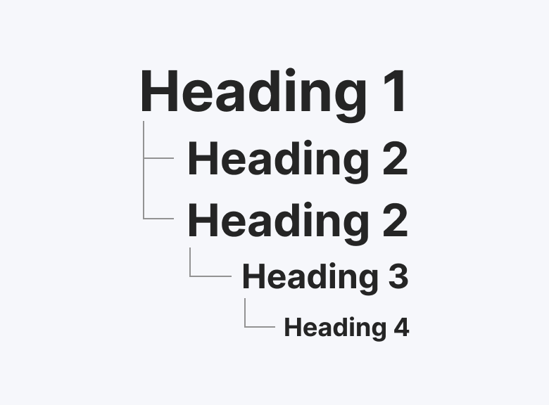
Use semantic HTML heading tags (e.g., <h1>, <h2>, <h3>, etc.) appropriately
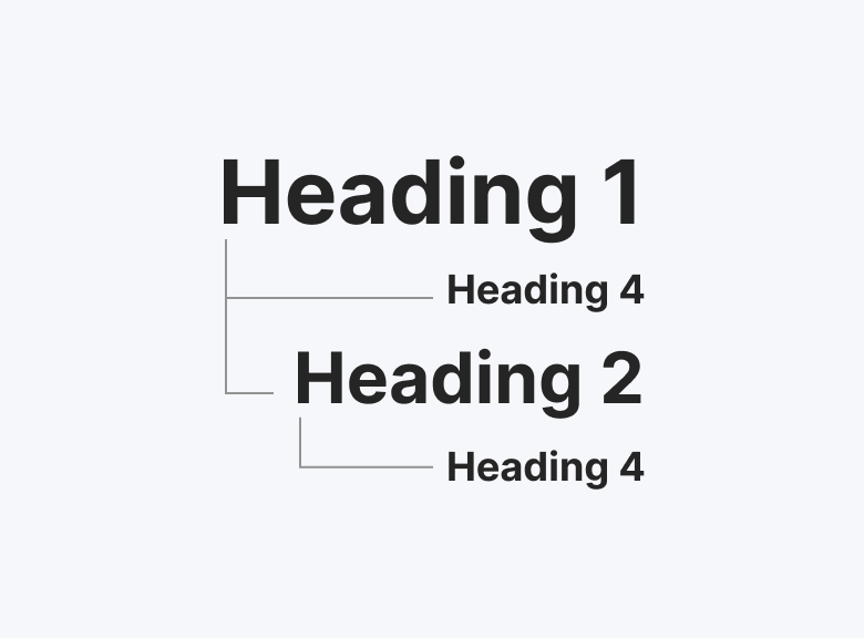
Don't use headings out of numerical order (eg. <h1>, <h4>, <h2>, then <h4>)
Labels are used for providing context and improve navigation
Labels are essential for form fields and interactive elements, providing descriptive text that explains their purpose or expected input. Screen reader users rely on labels to understand these elements' context and function, enhancing usability and accessibility.
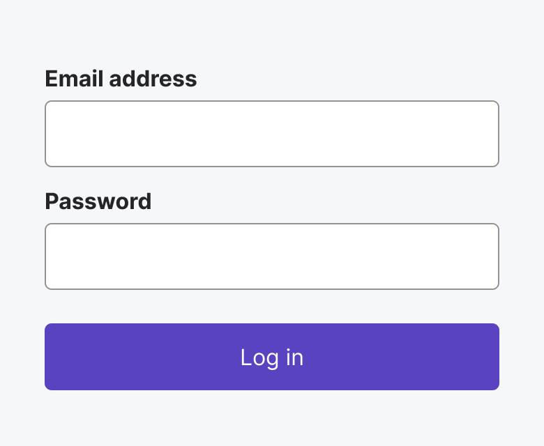
Use labels that are always visible
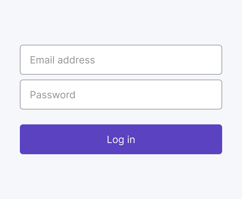
Don't use placeholder text as it disappears as soon as the user starts typing. It is also not read out by most screen readers
Colour and contrast
Non-text contrast should be at least AA 3:1
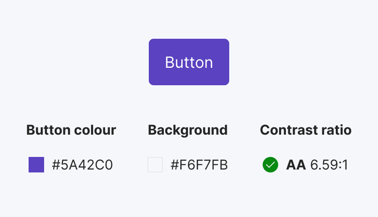
Ensure button colour against background is at least 3:1
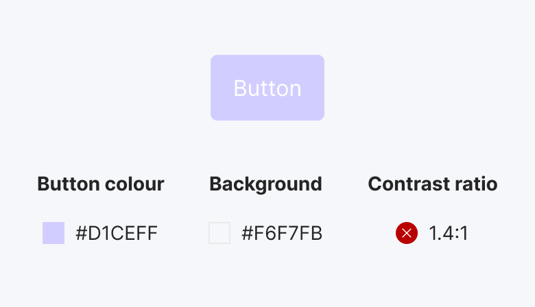
Avoid low contrast, eg. button colour against background is below 3:1
Text contrast should be at least AA 3:1 for large text, 4.5:1 for normal text
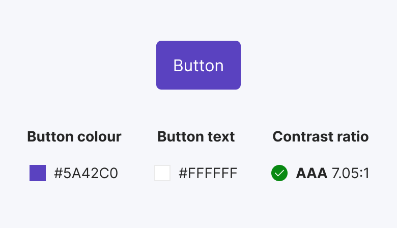
Ensure button text against button background is at least 4.5:1
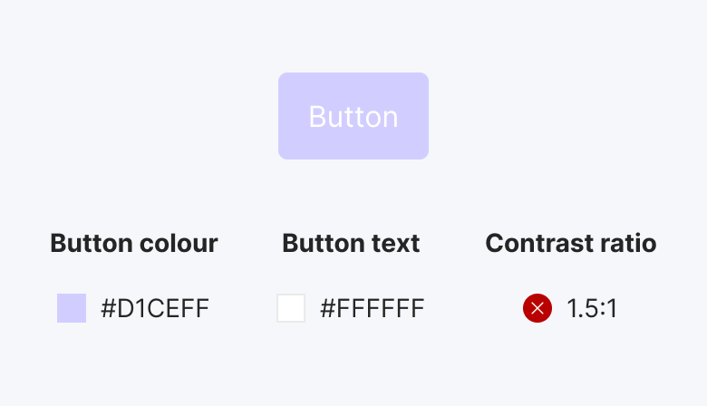
Avoid low contrast, eg. button text against button background is below 4.5:1
Here's a simple colour contrast cheat sheet for accessibility, showing the minimum contrast ratios recommended by the Web Content Accessibility Guidelines (WCAG) for text and images (non texts)
Colour Contrast Guide
WCAG 2.1 Level AA, minimum| AA | AAA | |
|---|---|---|
| Non-texts contrast | ||
| User Interface Components & Graphical Objects eg. Icons, Graphics, Border | 3:1 | |
| Texts contrast | ||
| Large text >24px, Bold text >19px+ | 3:1 | 4.5:1 |
| Normal text | 4.5:1 | 7:1 |
Error identification
Error identification in web forms refers to the process of highlighting and describing errors that occur when a user submits a form with incorrect or incomplete information. This helps users understand what went wrong and how to correct it, improving the overall user experience.
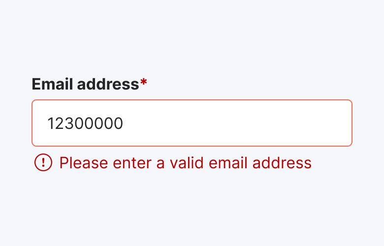
Use clear and informative error messages to guide users on how to correct their mistakes
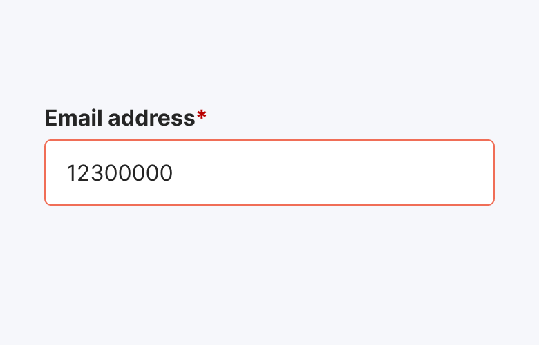
Don't use only colour to indicate an error as it would not be detectable to users with visual impairments
Text alternatives
Providing text alternatives for non-text content such as images, videos, and audio is important for web accessibility because it ensures that individuals who cannot perceive the non-text content (e.g., those who are blind or have low vision) can still access and understand the information.
Text alternatives can include
- Alternative text for images
- Descriptions for audio
- Transcripts or captions for videos
Alternative text for images
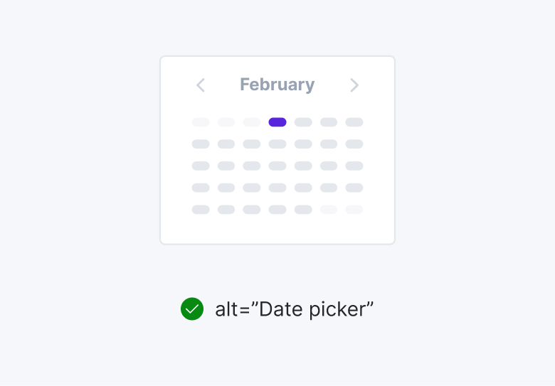
Include concise alternative text to describe or provide context to the image
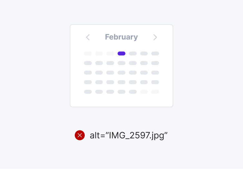
Avoid alternative text that is irrelevant to the information. Avoid alternative text for decorative images
Description for audio
Audio description narrates visual information in videos or live performances describing key visual elements like actions, settings, costumes, and facial expressions that are not communicated through dialogue or sound effects.
Transcripts or captions for videos
Transcripts provide a textual version of the entire spoken content in a video, while captions provide a synchronized text display of the spoken words in the video. Both are important for accessibility and can improve the user experience for a wide range of viewers.
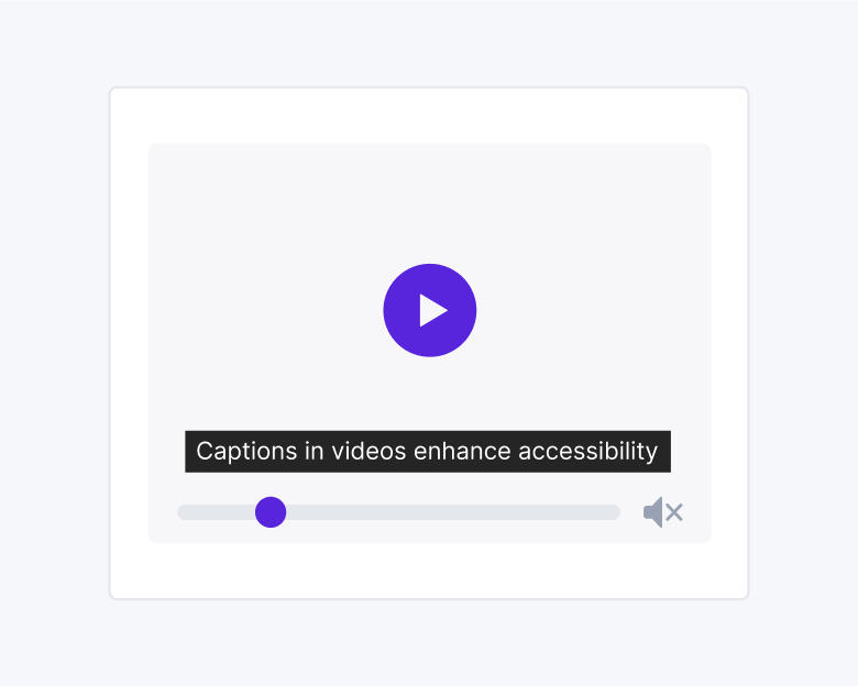
Add captions and appear at a pace that allows viewers to comfortably read and understand the content
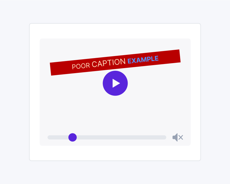
Don't use poorly formatted, inconsistent text size, colour, or placement that hinder readability and accessibility
Descriptive links
The purpose of descriptive links is to provide users with the proper context of where clicking the link will take them. It should include keywords or phrases that accurately describe the linked content, making it easier for users to understand where the link will take them.

Make links descriptive to ensure they convey meaning on their own
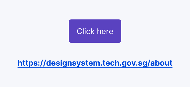
Don't use full URLs or generic phrases such as “click here” and “learn more”
Keyboard acccessibility
Keyboard accessibility refers to the design and implementation of digital content, to ensure that users can fully navigate, interact with, and operate the content using only the keyboard, without relying on a mouse or other pointing device. This includes enabling users to access all interactive elements, navigate through content, activate links and buttons, and submit forms solely through keyboard inputs.
Guide to Navigating with the Keyboard
This table includes common online interactions and the typical key inputs associated with each interaction| Interaction | Key inputs |
|---|---|
| Navigating through elements (eg. menu, button, link) |
Tab - move focus forward
Shift + Tab - move focus backward
|
| Navigating through lists of options (eg. radio button, dropdown list) |
↑ , ↓ - move vertically
← , → - move horizontally
|
| Scroll |
↑ , ↓ - scroll vertically
← , → - scroll horizontally
Space / Shift + Space - scroll by page
|
| Button and link | Enter - activate |
| Checkbox, radio button, dropdown | Space - select or unselect while focused |
| Modal | Esc - close |
Focus indicators
A focus indicator serves as a visual signal that highlights the element currently in focus on a web page or application. This feature is essential for users who depend on keyboard navigation or assistive technologies to engage with digital content.
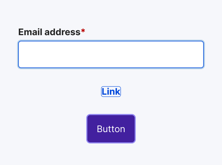
Highlight focused element such as links, buttons, form fields, and interactive components
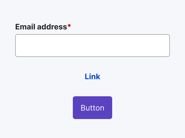
Don't remove or disable default focus styles provided by browsers or operating systems without providing an adequate replacement
Responsive design
Responsive web design provides a seamless and consistent user experience across devices as the pages automatically adjusts its layout, font sizes, and images to fit the screen size, making it easier for users to navigate, read content, and interact with the site.
The components, patterns and templates provided by SGDS are designed to adapt to the different screen sizes, providing a positive user experience across devices
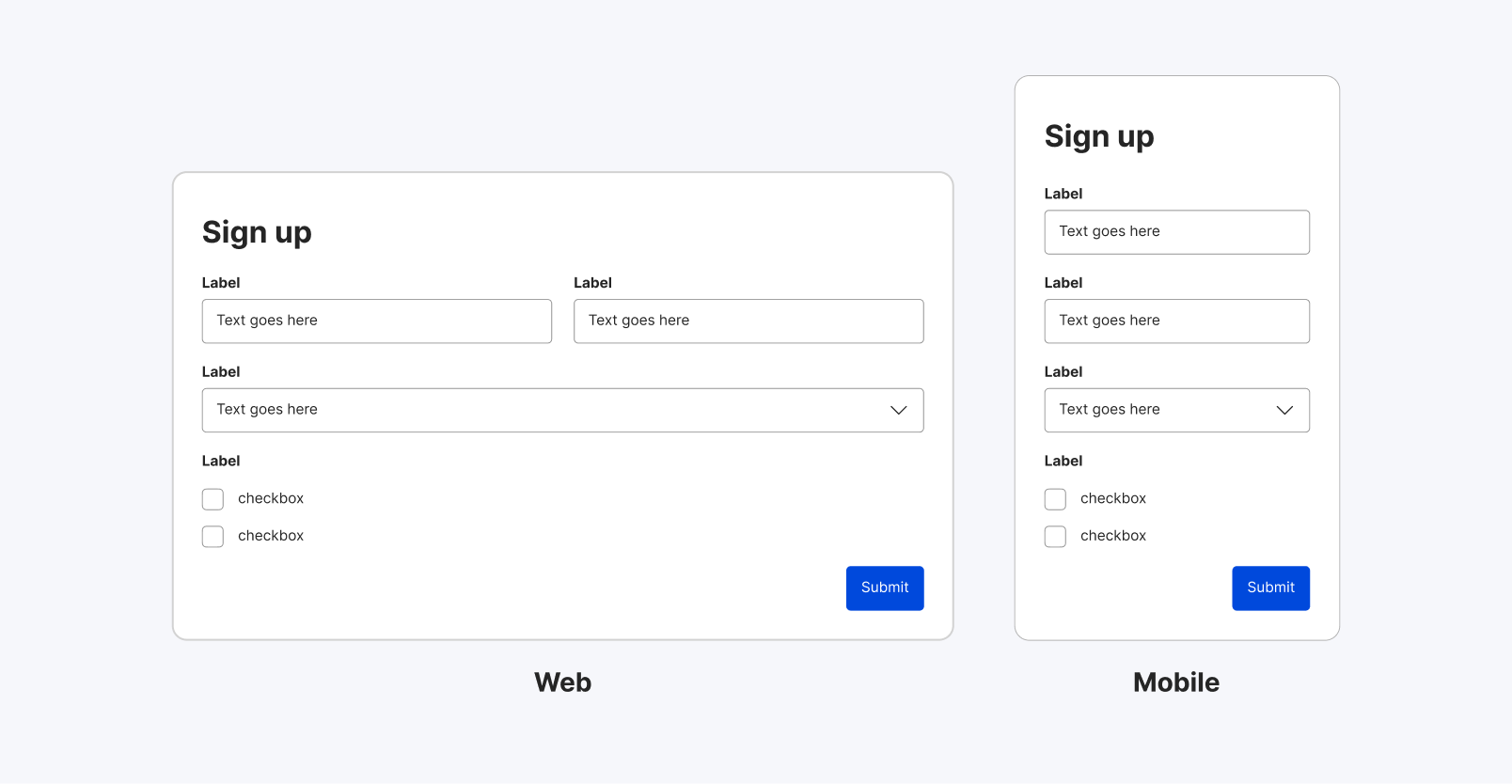
Our form and fields adjust their layout and sizes according to the screen size
Testing and validation
You can use automated accessibility testing tools to scan your website for common accessibility issues. These tools can identify issues such as missing alt text, low colour contrast, and missing form labels. Here is a Web Accessibility Evaluation Tools List that you can consider using.
Ideally, you should also conduct user testing with people with disabilities to gather more accurate feedback and identify any accessibility barriers that may exist on your website. For guidance on how to conduct user testing, we will soon have templates available under our UX design resources, expected to be released in Q3 2024. Stay tuned!
Resources
Understanding WCAG 2.1
Web Content Accessibility Guidelines (WCAG) 2.1 defines how to make Web content more accessible to people with disabilities.
For an introduction to WCAG, see the
Screen readers
A screen reader is an assistive technology, primarily used by people with vision impairments. It converts text, buttons, images and other screen elements into speech or braille.
Examples of screen readers for computers:
Examples of screen readers for mobile devices:
Last updated 31 May 2024
